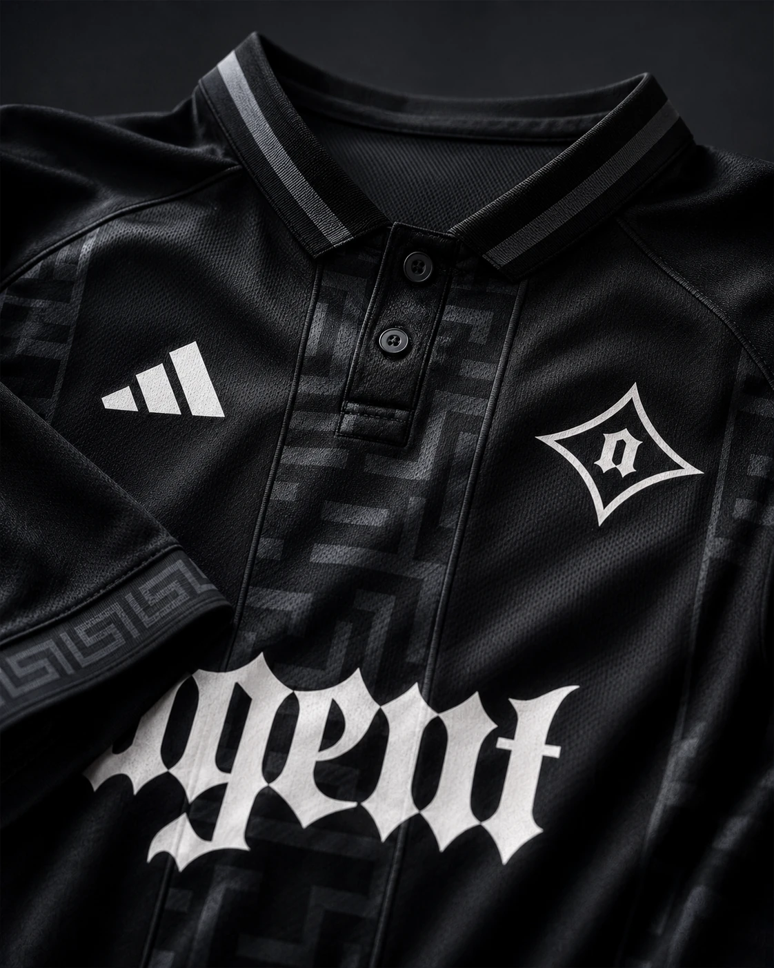




Lifestyle
Black and white lead apparel, product, and media moments. Red is used sparingly, only when it strengthens the application.
Red enters as punctuation. A tick, a seam, a single word.
AgentBrand Identity
The identity system for Agent: one parent brand across esports, media, apparel, and youth development.
Logomarks
The blackletter wordmark and diamond emblem operate from the same system. Use depends on context, not hierarchy.
Color System
Three colors run the whole company. What changes is the mix: lifestyle stays monochrome and editorial, esports runs hotter.
Black and white lead apparel, product, and media moments. Red is used sparingly, only when it strengthens the application.
Red enters as punctuation. A tick, a seam, a single word.
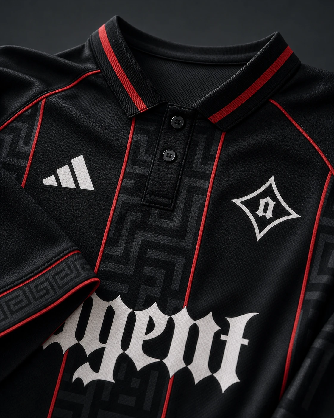
Black stays foundational, with red used more directly for profiles, scoreboard graphics, and competitive touchpoints.
Red is the competitive layer. Match days run hot.
Patterns
Apparel + Jerseys
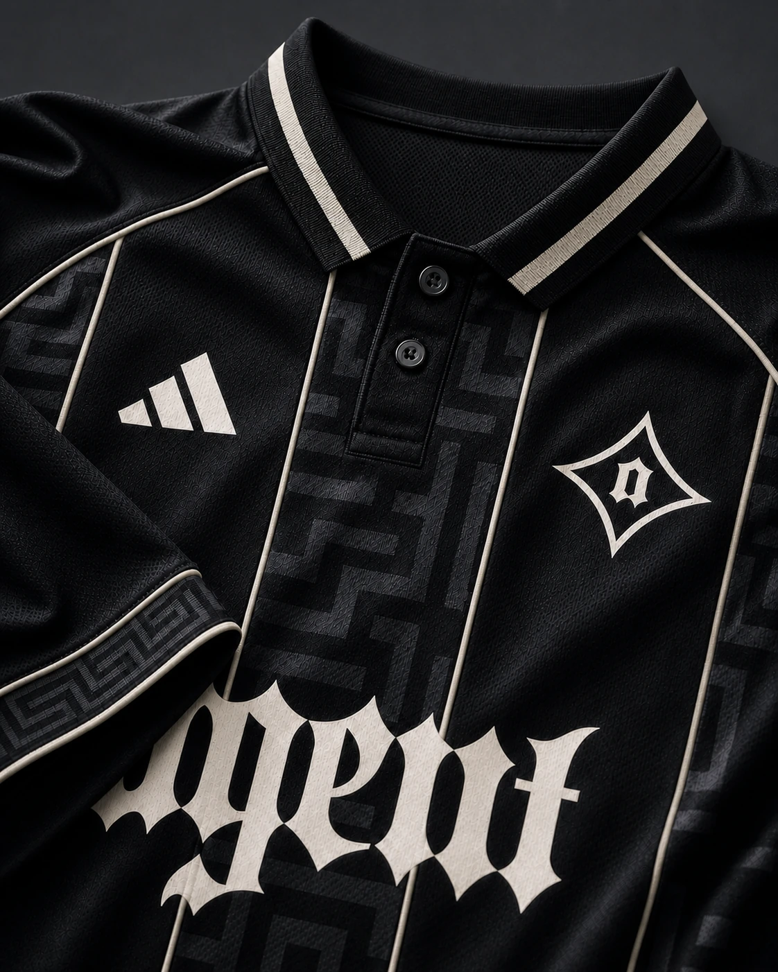
Ivory, red, and blackout take one jersey system from fabric detail to studio portrait and live competition.
01 In the fabric
02 In the studio
03 In the arena
Competition / Live
Stage light, broadcast color, player emotion. Live photography should feel immediate while keeping the black-and-ivory system unmistakably Agent.
Products + Mousepads
The blueprint field turns the desk surface into an Agent arena. Each concept changes the mark behavior while preserving the same monochrome foundation and red technical signal.
Social Identity
One core. Two expressions.
Agent holds the master identity in black and chrome. Agent Counter-Strike shifts the same marks into red for a title-specific competitive voice.
3x Champions
The home of Agent Counter-Strike. America’s Team.
The identity flex comes from color, context, and voice, not a new logo. Both accounts share the Agent wordmark, emblem, typography, and graphic logic.